
 Brand Guidelines
How we look. How we sound.
How we show up.
A working reference for everyone who makes things in the Kiana voice. Internal team, marketing, partners, and (eventually) the world.
Everything you need to make it sound and look like Kiana.
- The StoryWho we are and why we're here.
- LogoThe mark, how to use it, what to avoid.
- ColorCyan, ink, cream — and the in-between.
- TypographyFraunces and Inter, in working hierarchy.
- Voice & ToneHow Kiana sounds, with do's and don'ts.
- ImageryWhat looks like us. What doesn't.
- In UseReal applications: social, email, packaging.
We stand for more than game-changing teamwear.
(But yeah, we do that too.)
Kiana Sportswear is a custom teamwear and performance activewear brand built for women athletes. Founded by Sophie Grego, an athlete who got tired of women's kit being an afterthought of men's gear scaled down — sloppy fits, lazy designs, "shrink it and pink it" energy.
So we built our own. Patented women-centered fits. Inclusive sizing XS–3XL with no surcharges. Faster turnarounds. 10–15% less than the big guys. And every kit, designed for how women actually move.
The mission isn't subtle. Girls drop out of sport at twice the rate of boys by age 14. Seventy percent of girls who quit cite ill-fitting kit and body-image concerns. We can't fix all of that — but we can fix the gear. Let's change the game.
One mark. Two colorways. Always with room to breathe.
The Kiana wordmark is the foundation of everything we make. Use it generously, but always with the right contrast and clear space.
Full wordmark · "Kiana Sportswear"


Use the icon mark for tight spaces, social avatars, hangtag corners, and anywhere the full wordmark won't fit cleanly. Always keep clear space equal to the height of one chevron on every side.
The rules
Clear space
Always leave space equal to the height of the "K" on every side. No exceptions, no crowding.
Minimum size
Never render the logo smaller than 80px wide on screen, or 0.75″ in print. Below that, legibility breaks.
Contrast
Black on cream/white. White on ink/photo. Never on a busy background that fights for attention.
Don't
Cyan with conviction. Cream with calm.
The Kiana palette is built around one accent (cyan), one anchor (ink), and a quiet foundation of warm neutrals. Use cyan for moments of energy. Use cream and ink to let the work breathe.
Brand Cyan
The signature accent. Use for highlights, primary actions, hover states, link affordance, and italicized headline emphasis. Never for whole-section backgrounds — cyan stays loud by staying rare.
Foundation
The structural colors that do the heavy lifting. Cream backgrounds, ink for type, ink-2 for body copy. This is what 90% of every Kiana surface looks like.
Neutrals
The quiet supporting cast. Used for muted text, hairline dividers, captions, and metadata.
A serif with a sense of humor. A sans that gets out of the way.
Two typefaces, one job each. Fraunces does the talking. Inter does the explaining.
Fraunces
Used for: H1, H2, H3, big stat numbers, pull quotes, italicized emphasis. Heavy on letterspacing pull-in (-0.02em on big sizes). Italics in cyan for the Kiana signature look.
Inter
Used for: Body copy, button labels, navigation, captions, kicker labels (uppercase, letterspaced 0.18em). Always paired with Fraunces — never alone for headlines.
Working hierarchy
How sizes work in practice — desktop scale shown. All scale fluidly via clamp() on responsive surfaces.
We sound like the captain — not the corporation.
Kiana talks like a coach with a sense of humor. Direct, athletic, honest about the gap, never preachy. A little sarcastic when the moment earns it.
Five things we always are
Punchy
Short. Direct. No throat-clearing.
Athletic
Active verbs. Game-day energy.
Honest
About the women's gear gap. About us.
Fun
Confidence with personality.
Sarcastic
(A little.) Earned, never mean.
Do's & Don'ts
Signature lines & phrases
- Same Game. Same Grit. Equal Gear. — our headline tagline
- Let's change the game.
- Why should the guys have all the best gear?
- Tired of a Shit Fit? So are we.
- Got it. We're on it.
- 10–15% less than the big guys.
- Real Athletes. Real Fits. Real Reviews.
Real athletes. Real game days. Never staged-empty.
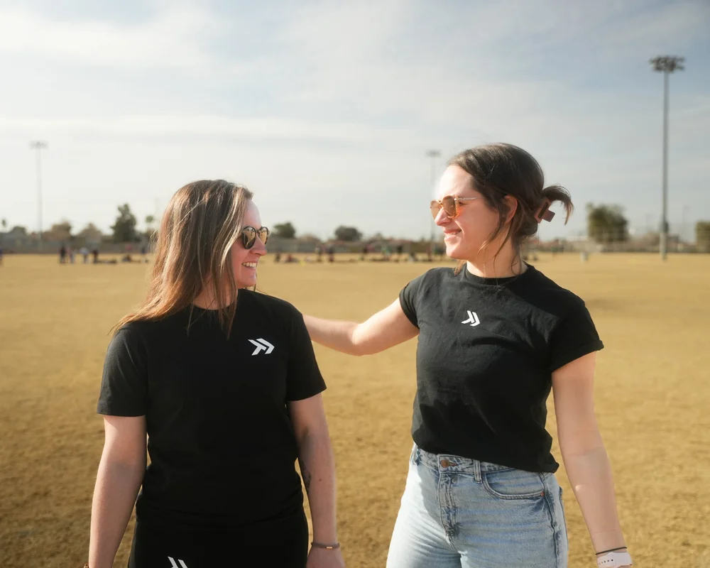
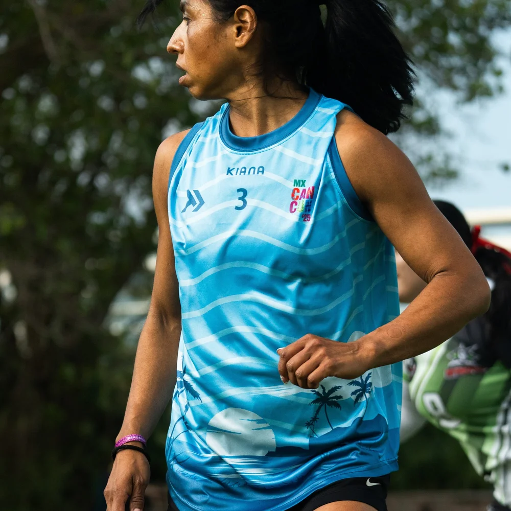
Kiana photography shows women athletes in actual Kiana gear, in actual settings — on the field, mid-action, post-game. Natural light over studio. Candid over posed. The kit always present, never the only thing in the frame.
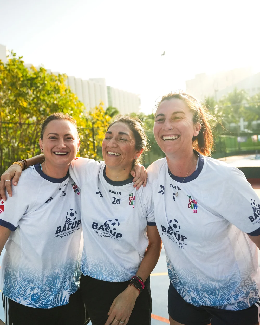
What we use
Female athletes in real Kiana gear
The garment matters. Show it actually being worn by women in action.
Natural light, on-location
Game-day fields, training spaces, locker rooms, candid moments. Not the cleanest studio.
Brand color when it shows up naturally
Cyan accents in kits, brand-colored gear in frame. Don't force it; do showcase it when it's there.
Diverse bodies, ages, sports
Inclusive sizing is a brand value. Imagery should show it.
What we avoid
How it shows up in the wild.
Quick reference for the surfaces our team makes most. Apply the rules above and you'll land in the right place.
Instagram post template
Caption recipe: Hook (punchy line) → context (1–2 sentences) → CTA. Use signature phrases. Tag the team. Always cyan italic for brand emphasis.
Email signature
Fraunces 600 for name, Inter 600 small caps for role, cyan for links, no logo image (text only — survives every email client).
Hangtag / packaging insert
Cream background, ink type, cyan italic emphasis. Care instructions in Inter 12px below the headline.
Caption-only social
Custom teamwear, women-centered fit, mockups back in 24 hours. → kianasports.com
Plain caption pattern: lead with a moment, follow with a feature, close with a link. Cyan reserved for the destination URL.